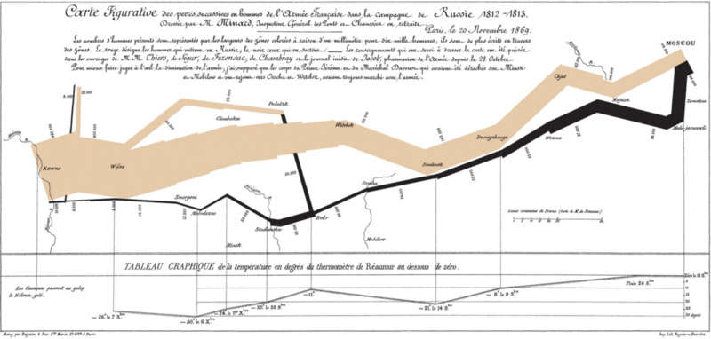
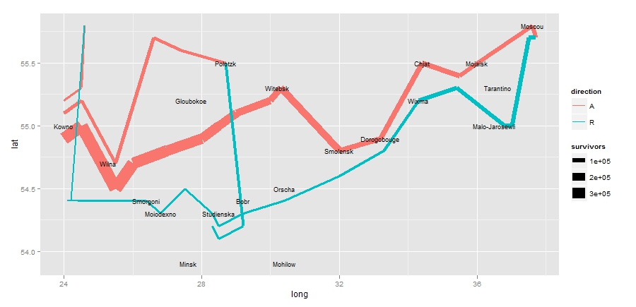
For this post, I attempted to reconstruct a famous visualization of Napoleon's March to Moscow. The French Invasion of Russia is considered a major turning point in the Napoleonic Wars. Up until that point, Napoleon's army was vast in size. By the end of his March on Moscow, the French army was reduced to a tiny fraction of its size.

Pictured above is Charles Minard's flow map of Napoleon's march. It is simply amazing that such a detailed and innovative graphic was published in 1869 (way before the first computer). Minard was truly a pioneer in the use of graphics in engineering and statistics.
The troops text file contains the longitude and latitude of Napoleon's army, both on the attack and retreat, on his march. The cities file contains the longitudes and latitudes of a few major Russian cities that were in Napoleon's path.
library(ggplot2)
library(maps)
library(mapproj)


troops <- read.table("minard-troops.txt", header=T)
cities <- read.table("minard-cities.txt", header=T)

russia <- map_data("world", region="USSR")
russia <- subset(russia, group != 32)

qplot(long, lat, group = group, data = russia,
      geom = "polygon")


ussr <- geom_path(aes(long, lat, group=group), data=russia)

ggplot(troops, aes(long, lat)) + geom_path(aes(size=survivors,
       color = direction, group = group, lineend="round")) +
       geom_text(aes(label = city), size = 3, data = cities)
The red line represents the attacking march while the blue line represents the retreat. The thickness of the line corresponds to the size of Napoleon's army at that point.


